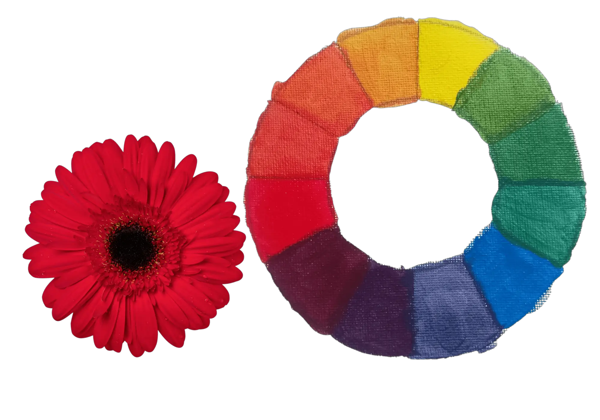
You might think that red is a primary color and it cannot be mixed by combining other colors. This is not essentially true. You can combine two colors to make red.
The two colors that make red are magenta and yellow. Mix magenta and yellow in a 1:1 ratio for the best results. orangish or pinkish-red can be made by altering this ratio. The mixed red color can be muted by mixing a dash of cyan. Red shades and tints are made by mixing black and white respectively.
Red is a great color to create different moods and emotions in your painting. You can create a specific red color by combining different red color paints and other paints to lighten or darken the color. You will also learn the exact steps to match a red color from a reference photo.
Two colors that make red: magenta and yellow
Two colors that make red are magenta and yellow. You can tweak the color you get by mixing different ratios of magenta and yellow. Also, the mixed red color can be muted or neutralized by mixing it with the complementary color of red.
You can make the mixed red warmer by mixing it with warm colors like orange or more yellow. Mixed red can be made cooler by mixing in with a dash/little blue that is cool.
I have written a whole article about acrylic paint color mixing charts. You can learn a lot about mixing all the primary and secondary colors there. There is a free downloadable color mixing chart and a grid as well.
If you do not understand any terminology like hue, or tint that is used when discussing colors, refer to the color terminologies box below.
Color Terminologies
There are different color terminologies you need to understand when discussing colors. I have described them below;
Hue: Hue means colors such as primary colors( red, blue, yellow) and secondary colors (orange, green, purple).
Value: The darkness or lightness of a color. Every color has a value. You can see this if you see a black and white photo of colors. Light colors like yellow are high in value while darker colors like red are low in value. The color black has the lowest value while the color white has the highest value.
Shade: Shade is the darker color you get when mixing a hue (color) with black. You can make dark to light shades by mixing in more or less black.
Tint: Tint is the color you get by mixing a hue (color) with white. By changing the amount of white you mix, you can get lighter tints.
Mass stone: Color of paint when painted thickly, straight out of the tube without diluting.
Undertone: Undertone can be seen when you scraped the paint on a white surface. Undertones can be different from mass tones because colors are not pure although there is a single pigment. Impurities of some colors give a different undertone. (e.g. Phthalo blue has a dark blue mass tone and greenish undertone)
Color bias: Every color (even primary colors) has a bias towards another color because there are hidden color pigments in the pure colors. (e. g. Phthalo blue has a green color bias while ultramarine blue has either green or red color bias)
Complementary colors: Colors on the opposite side of the color wheel. When complementary colors are mixed, a neutral or muted color will be made.
Cool colors: Cool colors are colors that remind you of the ocean and water. They include blue, green, and purple.
Warm colors: Warm colors will remind you of sun and fire. They are red, orange and yellow.
I used acrylic colors to mix red. In the below image you can see magenta and yellow at the two ends of the color swatch line. The middle colors are mixes of magenta and yellow. To the right of the color swatches, I have increased the amount of yellow color used. So colors go from red to orange.

I have also experimented with mixing different ratios of magenta and yellow. These are magenta: yellow ratios as 1: 1, 2:1, and 3:1. Below I will show you the results of each of these ratios.
Magenta can be different from brand to brand. The best choice you can make is getting Quinacridone magenta in artist-grade paints. You can also get primary magenta. For this experiment, I have used student-grade primary magenta.
You may see magenta as almost red in these images. But there is a slight difference between magenta and red. But after drying on canvas it almost looks like a lighter red.
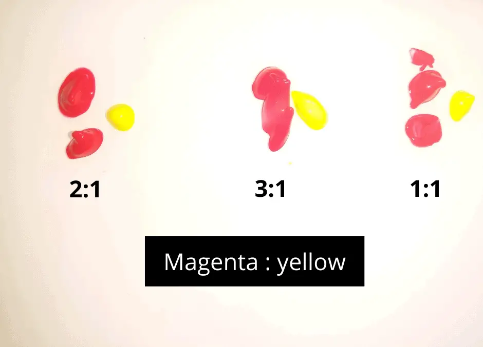
Here is how it went after mixing the colors.
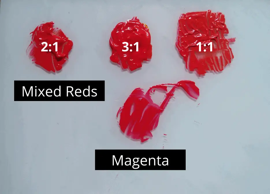
You might have noticed the pinkish-red color in magenta and the bright red colors in the mixes. As you can see, the more you add magenta to the mix, there will be strong the red color. You can see it in the mix with a magenta: yellow ratio of 3: 1. This is only applicable if you are using student grade primary magenta and yellow.
Now let’s see how to mix red with an artist-grade acrylic paint brand like Golden. I have tested the Golden color mixer to mix magenta and yellow in different ratios. It gives a real-time look at the mixed colors (color swatch) and parts of each color mixed in the paint tubes on the left. You can check my results below.
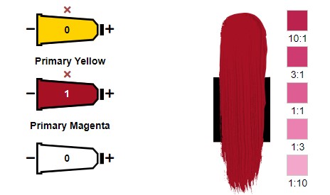
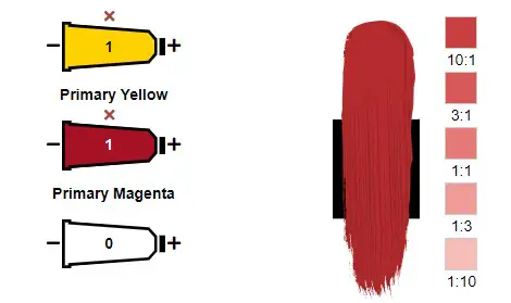
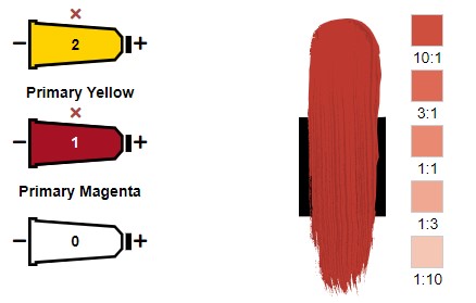
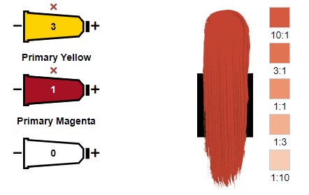
As you can see, the best way to make red with yellow and magenta is to mix equal parts of each color. By mixing more yellow you will get an orangish-red color. Mixing more magenta yields a pinkish-red color.
Isn’t red a primary color that cannot be mixed?
Since our primary schools, we were taught that red is a primary color. Primary colors can be used to mix all the other colors. But they cannot be created by mixing two other colors. The traditional primary colors are red, yellow, and blue.
However, there is another color model that uses different colors than red, blue, and yellow. It is the CMYK color model. It uses magenta, cyan, and yellow as primaries. Generally, the colors mixed using cyan, magenta, yellow and black(CMYK) are lighter, vivid, and vibrant while red, blue, and yellow (RBY) provide a color palette that is dull and darker.
RBY and CMY color models
Red is a primary color in the RGB color model. It has red, green, and blue as primary colors. The RGB model is used in digital screens. The mobile phone or the computer screen you are viewing in this article uses RGB colors to display all these vivid different colors.
Artists have long known the three primary colors as red, blue, and yellow (RBY). Of course, these primary colors are still valid. Artists can expand their color palette and make any color they want if they use both CMY and RBY primary colors.
Generally, the colors mixed using cyan, magenta, and yellow (CMY) are vivid and vibrant. But red, blue and yellow (RBY) also provide a color palette that is more on the darker side. Here I have thought of doing two color wheels. One with RBY primaries and the other with CMY primaries
CMY color wheel with acrylics
Following is the color wheel I made using CMY acrylic primary colors on a canvas.
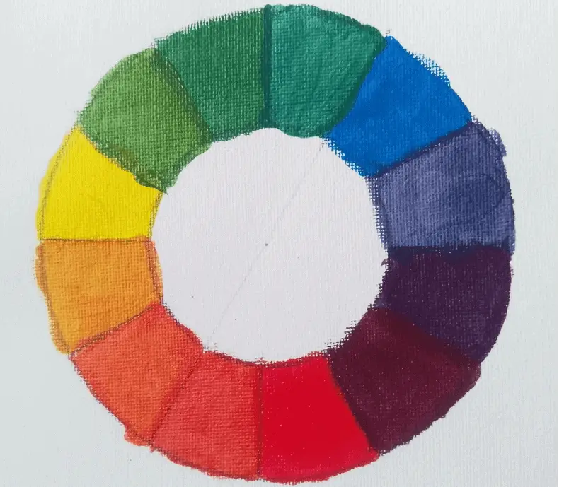
See how vibrant and beautiful these colors are? You can always make several different hues of these colors by adjusting the ratios of each color as you paint.
For this color wheel, I used student-quality acrylics. But if you choose the artist’s quality acrylics, you can get a more vibrant look of the same color.
RBY color wheel with acrylics
Following is the color wheel I made using red, blue, and yellow (RBY) as primary colors.
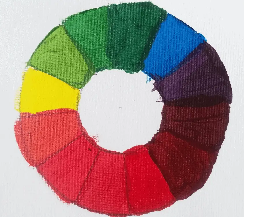
Here you will see a color palette that is more towards the darker side. But there are of course some vivid vibrant colors.
As an artist, you can use both of these primaries to suit your painting.
Note: It is important to note that, you only need a simple colour palette with only primaries (red, magenta, cyan, primary blue and yellow), white and, black to paint. You do not need of sets of colour tubes.
Mixing different hues of red using different red colors
If you want to mix a particular red color with paint, it is easier to mix different red colors and dark or light colors to increase or decrease the value and saturation of red. However, you can use cyan, magenta, and yellow as primaries and mix these red colors as well.
You can also mix red for digital screens by mixing the primary colors red, blue, and green according to the RGB color system or mixing cyan, yellow and magenta according to the CMYK color model.
Below I have included different hues of red you can mix for painting or digital screens. I have included hex code, CMYK values, and RGB values. If you are painting, I have included the names of acrylic colors (particularly Golden Heavy Body Acrylics but related to other brands as well) and how many parts need to be mixed.
Scarlet: Mix 1 Cadmium Red Light * 8 Pyrrole Orange
Hex #FF2400
CMYK 0, 78, 100, 8
RGB 235, 52, 0
Carmine: Mix 16 Naphthol Red Medium * 8 Cad Red Dark * 1 Quin Violet
Hex #960018
CMYK 0, 98, 82, 40
RGB 153, 3, 27
Burgundy: Mix 5 Quin Magenta* 1 Naphthol Red Medium * 3 Cad Red Dark
Hex #8D021F
RGB 141, 2, 31
CMYK 0, 99, 78, 45
Crimson: Mix 22 Naphthol Red Light * 10 Pyrrole Red * 1 Cad Red Dark Hex #B80F0A
RGB 184, 15, 10
CMYK 0, 92, 95, 28
Ruby: Mix 3 Primary Magenta * 1 Zinc White
Hex #E0115F
RGB 224, 17, 95
CMYK 0, 92, 58, 12
Maroon: Mix 99 Naphthol Red Medium * 1 Hookers Green Hue
Hex #800000
RGB 128, 0, 0
CMYK 0, 100, 100, 50
Fire Brick: Mix 94 Cadmium Red Medium Hue * 4 Zinc White * 1 Hooker Green Hue
Hex #B22222
RGB 178, 34, 34
CMYK 0, 81, 81, 30
Raspberry: Mix 2 Pyrrole Red * 1 Pyrrole Red Light * 1 Zinc White
Hex #D21F3C
RGB 210, 31, 60
CMYK 0, 85, 71, 18
As you can see you can mix pyrrole red, cadmium red, naphthol red, and magenta to create specific red colors. To mute the red colors you make you can mix a dash of hookers green as green is a complementary color to red or magenta.
You will also notice when a color needs to be lightened, zinc white is used instead of titanium white. This is because white is less intense and less overpowering than titanium white making it the best choice for mixing colors.
You can also mix these colors using cyan, magenta, yellow and black with the values or percentages mentioned as CMYK. You can also use red, green, and blue to mix the colors according to the RGB values.
How to mute the red color?
In a painting, there are very few bright and vibrant colors. Most colors you find in a painting are muted. It applies the same to red color. If you want to mute the red color you need to mix it with its complementary color. I will explain this with the CMYK color wheel below.
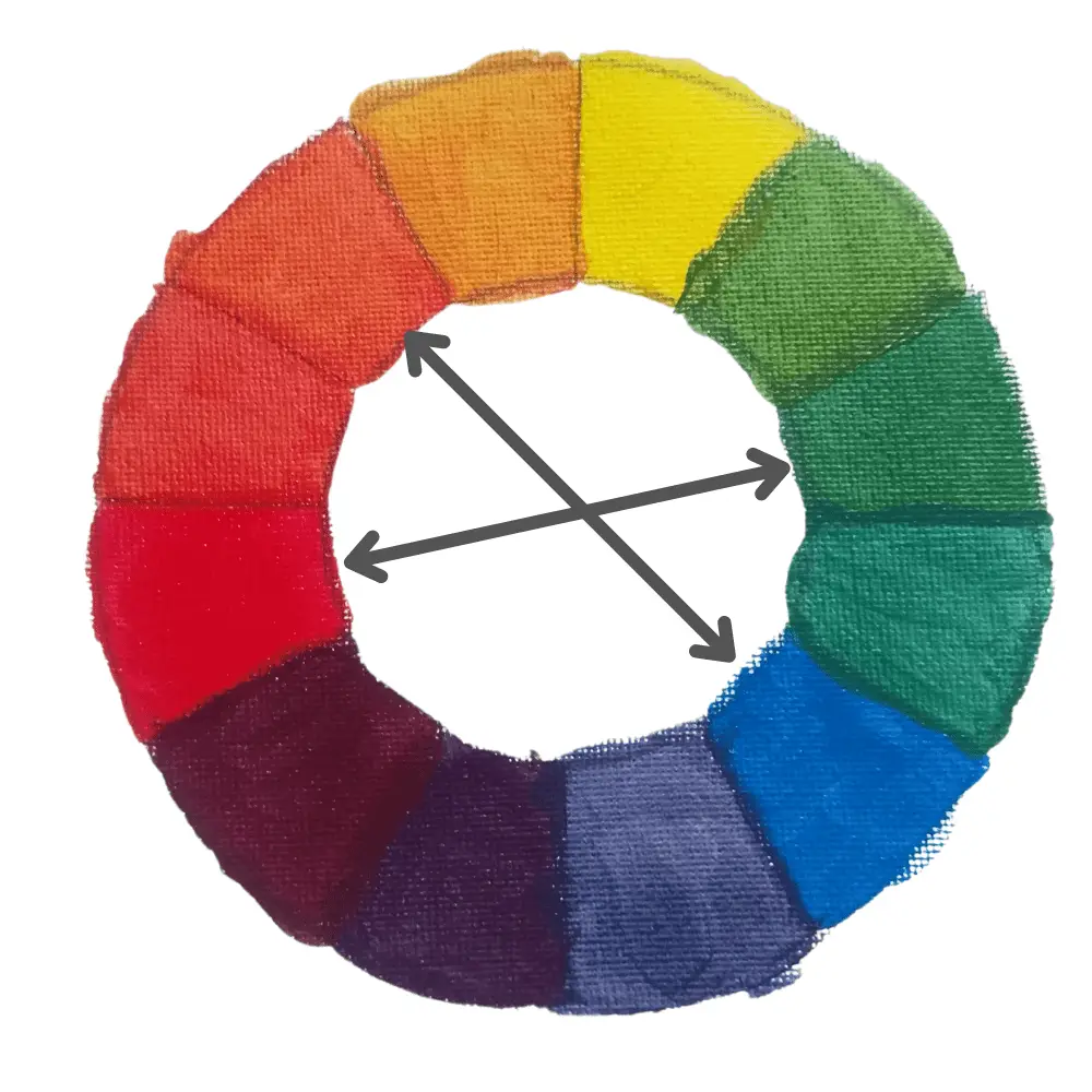
As you can see in the color wheel, the complementary color of magenta is green. If you want to mute magenta you need to mix it with a little green color. The complementary color of mixed red is cyan. So if you want to mute the mixed red from magenta and yellow, you need to mix a little cyan into it.
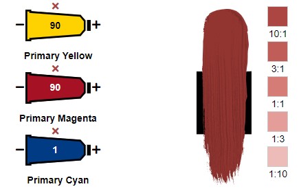
As you can see in the image also, mixing equal parts of magenta and yellow, with a dash of cyan yields a nice muted red color. Not only red, but you can also mute any color by mixing it with its complementary color on the color wheel.
Mixing different shades and tints of red
Shades were made by mixing black with color. Tints are made by mixing white with a color. I tried mixing different shades and tints on a canvas. Following is an image of it (the colors are transparent as I used student-grade acrylic paint on canvas).

When you are making red shades make sure to mix a very little amount of black. I have made tints of the same red shades by mixing white. The tints of red are different pink colors. When I have mixed in more yellow to make red, the tint becomes warm or yellowish.
Although you need black to make red shades, it is a tricky color because black can take over the mixed colors easily. The best way to obtain darker muted colors is by mixing them with complementary colors. You can also mix with less strong muted colors such as burnt umber.
As you can see, my color swatches are very transparent and not rich in color or pigment. If you want to get the high pigmented, rich colors that are opaque and cover well, use artists-grade acrylic paints. Golden artist-grade acrylic paints (link to view on Blick Art Materials) are one of the best artist-grade acrylic paint.
If you can not afford artist-grade acrylic paint, you can use high-quality student-grade acrylic paint. I have written a whole article about comparing 5 student grade acrylic paints and picking a winner. You can make the best choice for affordable acrylic paint by reading that article.
Steps of mixing a red color to match a reference
Color mixing is not throwing together colors that you think of. It has a set process. I am going to explain to you the process to follow to mix and match the red color of the reference image below.
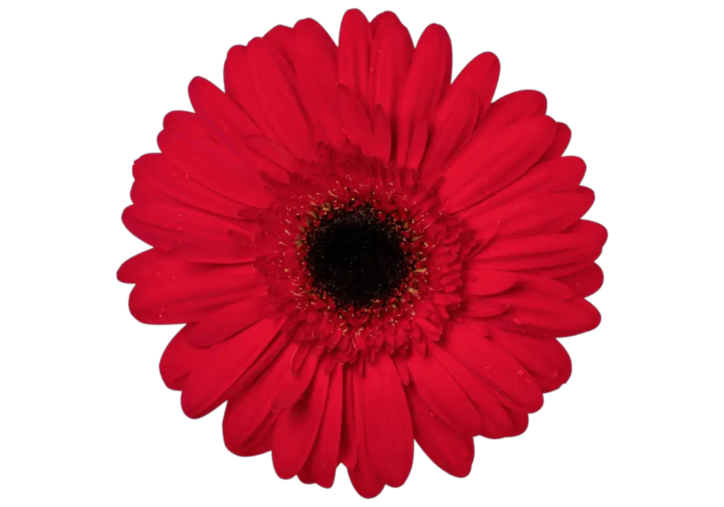
Step 1: Make a color wheel with cyan, yellow, and magenta as the primary colors. You can follow the below video for the detailed steps of making a color wheel and mixing colors.
Step 2: Match the hue of the red in the reference photo to a hue in the color wheel. For my color wheel, the best match for the hue is magenta. This can differ according to the color brand you are using.
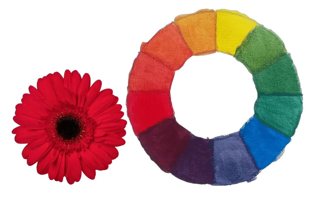
Step 3: determine the vividness or dullness of the item. If it is a dull color you need to mix the complementary colors and mute the red hue. For me, magenta is too vivid. Hence I mixed in a dash of green to mute the color magenta. Make sure you use very little.
Step 4: Next match the value of the color by mixing in white. I wanted to increase the value of the mixed magenta. So I mixed in a very little titanium white. Again the amount you want to mix depends on the quality of the paint you are using.
Now you will end up with an exact match of the red color to the reference photo.
Using red to create different effects and emotions
Red is needed to create different moods and effects in the painting. Below I have included a table with different red hues and where they are best suited to your artwork.
| Red hue | Hex code | Where it is best suited |
| Scarlet | #FF2400 | This orangish-red color can be used to indicate immoral or sinful behavior |
| Carmine | #960018 | This purplish bright red color reminds us of activity, energy, passion, and aggression |
| Fire brick | #B22222 | This brownish-red color is the color of a ceramic material that is used to line fireplaces, kilns, and furnaces |
| Burgundy | #8D021F | This elegant red color is used to indicate wealth and power. It is best used with shades of grey, gold, yellow, and teal |
| Crimson | #B80F0A | This warm red color is used to indicate passion, determination, love, and excitement |
| Ruby | #E0115F | This deep red color is associated with good fortune, wealth, love, passion, and courage |
| Maroon | #800000 | This warm deep red color indicates passion, beauty, creativity, and relaxation |
| Raspberry | #D21F3C | This red is the color of raspberry. It evolves flavourful feelings like raspberry |
In your paintings or artwork, you can use red as described above.
Conclusion
Red can be mixed by combining magenta and yellow. The best ratio to mix red would be one part magenta and one part yellow. You can mix specific red colors with magenta, yellow, and cyan (primary color according to the CMKY color system). However the easiest way to mix a specific red color with paint is mixing certain red color paints already available with some other colors as I have explained above, You can also make different shades and tints of red color.

