Color mixing is fundamental when painting with acrylics. When you know how to mix colors and what to expect, it will be so much easy to build depth in your painting. In this case, a color mixing chart will come in handy.
An acrylic color mixing chart helps to identify what colors to mix to obtain a certain color. It is an in-depth analysis of color mixing. Perhaps the best way to explore the colors (brand and quality) and explore the capabilities of colors used by an artist.
Let’s explore how to use an acrylic color mixing chart for your paintings and how to make one yourself. There are many things that we need to learn about how colors interact and the results we can expect when mixing colors.
Acrylic color mixing chart overview
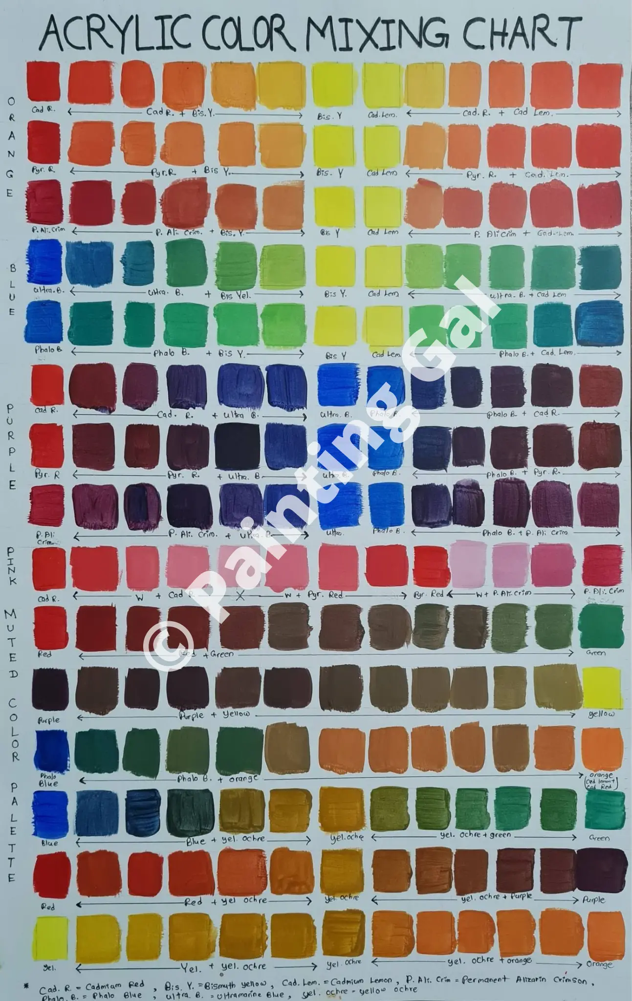
Below is the color mixing chart I have made. There are many color mixing charts online. Most of them use so many different colors and mix every color with other colors. It only has one color swatch for a mixture of two colors. There is no change in the ratio of the two colors mixed. However, you can make many different colors by changing the ratio of the two colors mixed. You can see that from the below chart.
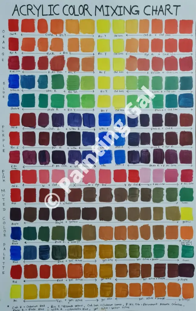
To make this color mixing chart, I only used 7 colors including white. As you can see there are so many colors you can make only using these 7 colors.
The 1st three rows of the acrylic color chart show you the orange color mixed using 3 different red colors and 2 different yellow colors. 2nd Two rows have green colors made with two different blue and two different yellow colors. The 3rd 3 rows show you purple colors made with 3 different red colors and 2 different blue colors.
The next row shows different pink colors you can make with 3 different red colors and white. The rest of the colors at the bottom of the color palette are muted colors. These were made by mixing complementary colors and mixing with yellow ochre.
You can make your color mixing chart using the colors you already have. This is the best choice. You can use my color mixing chart as a guide. Feel free to refer to my color mixing chart as well. You can get a good idea of how colors work together.
You can download a PDF of my color mixing chart and the grid I made to mix your own colors, for free, by clicking on the button below.
Following is a demonstration of how to use my color mixing grid to make your own color mixing chart with the colors you have. Enjoy!
How can you use the acrylic color mixing chart?
Let’s see how you can use an acrylic color mixing chart for your painting. When painting you will need to mix a certain color. This may be a color from a reference photo. You may be looking for the best color in the context of the painting.
Now, look at the color mixing chart and find the color you want in the painting. It is best if the color mixing chart is one of your own, or else you can use my colors mixing chart as a reference.
In my colors mixing chart, after choosing a color swatch, look at the bottom row to see what two colors are used to mix the color you chose.
As an example let’s assume you want to mix the second color swatch on the first row. If you look at the bottom line of the first row, you can see that it is made by mixing cadmium red with bismuth yellow. As the orange color is more towards the cadmium red, it is made by mixing more cadmium red and less bismuth yellow.
Color matching
When you are color matching, choose the closest color from the color mixing chart that matches your color. Now see what two colors are used to make that color. You can change the value (lightness or darkness of a color) of the color by changing the ratio of the two colors mixed.
Color Terminologies
There are different color terminologies you need to understand when discussing colors. I have described them below;
Hue: Hue means colors such as primary colors( red, blue, yellow) and secondary colors (orange, green, purple).
Value: The darkness or lightness of a color. Every color has a value. You can see this if you see a black and white photo of colors. Light colors like yellow are high in value while darker colors like red are low in value. The color black has the lowest value while the color white has the highest value.
Shade: Shade is the darker color you get when mixing a hue (color) with black. You can make dark to light shades by mixing in more or less black.
Tint: Tint is the color you get by mixing a hue (color) with white. By changing the amount of white you mix, you can get lighter tints.
Mass stone: Color of paint when painted thickly, straight out of the tube without diluting.
Undertone: Undertone can be seen when you scraped the paint on a white surface. Undertones can be different from mass tones because colors are not pure although there is a single pigment. Impurities of some colors give a different undertone. (e.g. Phthalo blue has a dark blue mass tone and greenish undertone)
Color bias: Every color (even primary colors) has a bias towards another color because there are hidden color pigments in the pure colors. (e. g. Phthalo blue has a green color bias while ultramarine blue has either green or red color bias)
Complementary colors: Colors on the opposite side of the color wheel. When complementary colors are mixed, a neutral or muted color will be made.
Cool colors: Cool colors are colors that remind you of the ocean and water. They include blue, green, and purple.
Warm colors: Warm colors will remind you of sun and fire. They are red, orange and yellow.
If you want to make a color lighter mix more of the lighter color. If you want the color to be darker, mix more of the darker color. You can make a color lighter and pastel by mixing it with white. Use a dash of titanium white or use more zinc white to make the color lighter.
Titanium white is stronger and can overpower other colors very easily. Zinc white is more transparent and less overpowering, making it best to mix with colors. Every time you mix a color with white, you reduce its strength and make a less saturated color.
If you want to make muted colors, after choosing the closest muted color to the color you want to match, you can experiment by changing the ratios of primary colors mixed. As an example, if you want to mix a muted green color, you can change the amount of yellow, blue, and red added to the mix until you satisfy.
Keep in mind that the more you add cool color the cooler the mixed color would be and the more you add a warm color the warmer the color would be, as such, the more you add the complementary color the more muted the mixed color would be.
Interpreting the acrylic color mixing chart
There are some important things you can interpret from a color mixing chart. In a color mixing chart, you will notice that some colors are muted while others are vibrant and saturated.
You can get vibrant orange colors with cadmium red. You will get muted orange colors with pyrrole red and permanent alizarin crimson. Also, you will get muted green colors with ultramarine blue and vibrant green colors with phthalo blue.
To get the most vibrant and vivid green color, mix lemon yellow, and phthalo blue. Pthalo blue makes muted purple colors while ultramarine blue, cadmium red, and pyrrole red make vibrant purple colors.
You can get a killer vibrant pink color with cadmium red, but you will get muted pink colors with pyrrole red and permanent alizarin crimson. permanent alizarin crimson also makes a beautiful and unique pink color.
You can get different brown colors by mixing complementary colors. You can also mute the colors using yellow ochre. But you can see mixing with yellow ochre desaturate the colors more and may even make the colors transparent if yellow ochre is transparent.
So the best way to make colors muted is by mixing them with their complementary color.
Limitation of acrylic color mixing chart
There are a few limitations of color mixing charts, even though you can learn so much from them and make painting easier. The main limitation is color mixing charts have less capacity to show all the possible color swatches we can mix.
In my acrylic color mixing chart, I mostly showed the colors obtained by mixing only two colors. I showed mixing 3 colors when mixing a secondary color with its complementary primary color or when mixing a secondary color with yellow ochre.
There are many color combinations you can make by mixing two secondary colors or mixing a secondary color with a primary color. However, it will make the chart even bigger. In my color mixing chart, I have shown you the main and important color mixtures you can make with only primary colors and with yellow ochre.
Another limitation is that the color mixing chart I made does not have tints ( colors mixed with white) or shades (colors mixed with black). You will need a bigger color chart to do that. One option would be using color swatch cards for each color mixture rather than having one large color mixing chart.
The benefit of using a color mixing chart
The main benefit of using a color mixing chart lies in making the color mixing chart. When making a color mixing chart by yourself you can learn so much about colors and how they work together.
You can make an awesome color mixing chart by using only primary colors. I have only used 7 colors to make my acrylic color mixing chart. Use both cool and warm colors in each color. As an example, I use two blues. One blue is a cool color which is phthalo blue. Another blue color is a warm blue color which is ultramarine blue.
Likewise, you can make all the colors possible using a limited color palette with cool and warm colors. Color mixing charts also help us make any color that we want easily. This can be done by picking up a color swatch in the color mixing chart and making it by mixing colors with a limited color palette.
Even if you like to use many different colors, a color mixing chart is very useful. In that case, you will need to make your color mixing chart including the missing colors, as my acrylic color mixing chart only has 7 colors to it. Also, you can refer to other color mixing charts online that have the particular colors you are using.
How do you set up a color mixing chart?
As I said before, making your color mixing chart is the best choice. It will give the exact color you can get by mixing the particular paint you have on hand. Because the mixed color usually changes according to the brand and color you have. Let’s learn in detail, how to make a color mixing chart.
Gather the materials you will need
To make the color mixing chart, you will need the following materials
- Watercolor Paper
- Pencil
- Ruler
- Acrylic colors
- Brushes
For the paper, you can use thick paper like watercolor paper. It will make it easy to put different colors without buckling the page. You can use a pencil and a ruler to put down the grids for the color swatches. I have also included the downloadable color mixing chart grid.
The color mixing chart grid will help you decide the places for color swatches. You can also download the chart I have provided below. You will learn more about making a color mixing chart grid in the below sections.
You will also need a cup of water to wash the brushes as you go. Keep paper towels on hand to wipe off the paintbrushes. It is best to have several paintbrushes when mixing colors.
You can use the brush to mix acrylic colors as you will only need a small number of mixed colors to put down a swatch. If convenient you can use a palette knife as well. I will explain in detail what colors to use in the below sections.
Acrylic colors and brands to use
When making a color mixing chart or when you do your paintings, it is a good choice to have decent quality or higher quality acrylic paints. Otherwise, you will be frustrated when mixing colors. The low-quality paints have less saturation and intensity and it’s easy to get muddy colors.
However, you don’t have to get a bunch of colors to make a color mixing chart or do a painting. Using a limited color palette containing warm and cool colors from each color will be the best choice. The following are the only colors you will need to mix with other colors.
- Cadmium yellow medium (warm yellow)
- Cadmium Lemon (cool yellow)
- Ultramarine blue (warm blue)
- Phthalo blue (cool blue)
- Cadmium red or pyrrole red (warm red)
- Permanent Alizarin Crimson (cool dark red)
- Titanium white (Neutral)
- Yellow Ochre (optional)
For my color mixing chart, did not have a warm yellow which is cadmium yellow at hand. Therefore I used Bismuth yellow instead. You can get these acrylic colors in artists’ grade. It is the best choice. If not get a few colors in good quality brands.
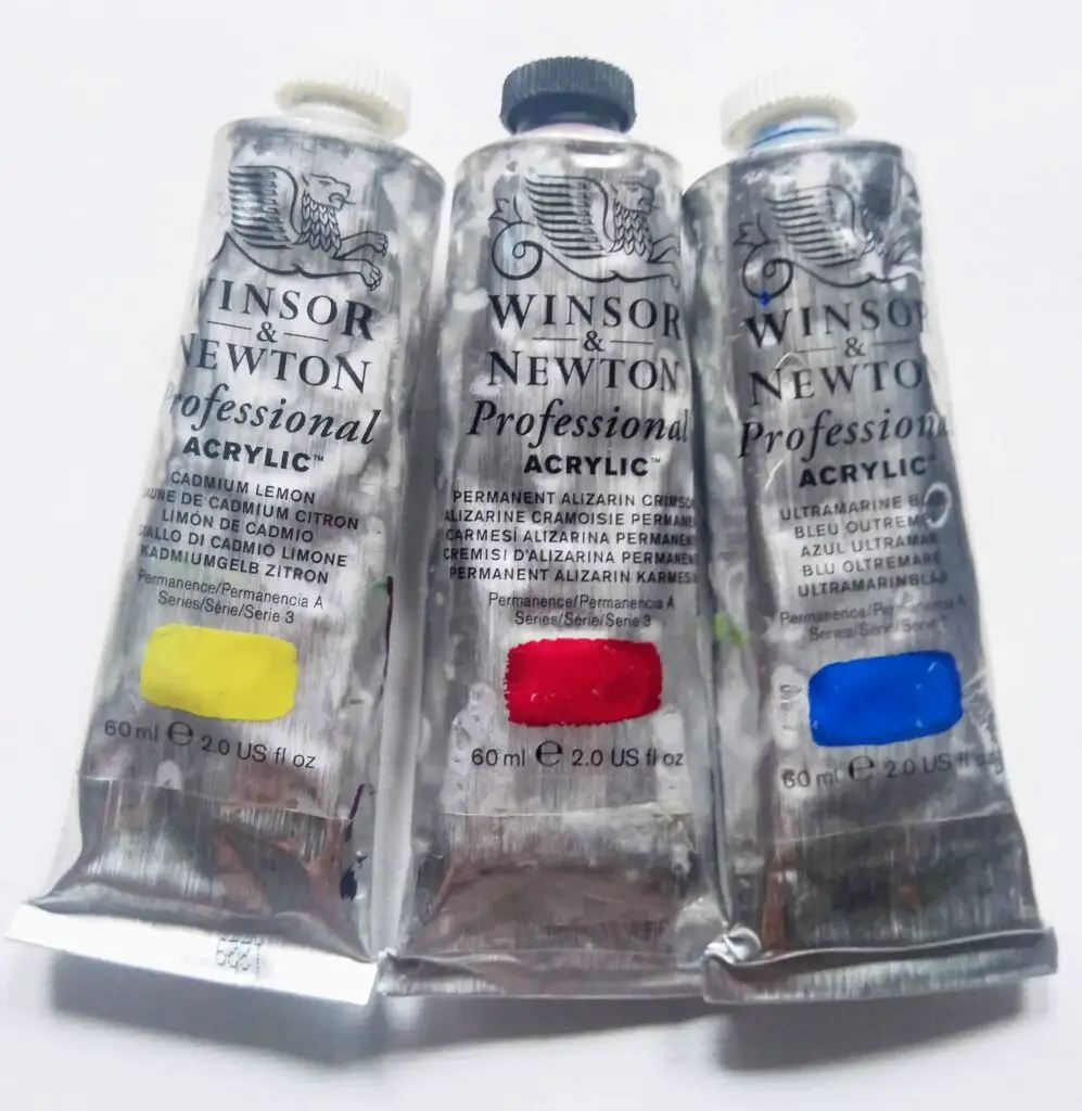
If you are on a budget the best choice would be Liquitex Basics. If not choose all the 7 colors from Golden Acrylic paint or Liquitex professionals. You can use other artist-grade acrylic paints as well, such as Sennelier.
I also wrote an article about the best acrylic paint brand for a beginner. You can find a comparison of 5 acrylic paint brands and pick a winner.
It also doesn’t matter if you have a wide variety of colors. You will be able to explore many colors and get the best out of them.
Never think as if you are wasting colors by using them for this exercise. This color mixing exercise helps you to improve your paintings very much so it’s not a waste of paints.
Although my limited color palette has mostly primary colors, which in theory cannot be mixed with other colors, they can be mixed using other colors. I have written articles about mixing red, mixing yellow, and mixing blue with acrylic colors. You will learn many interesting color facts there.
Making the color mixing chart grid
Now that you have the right colors let’s make a grid to put on the mixed colors.
Some make the grid by making rows and columns equal to the number of colors they have. Then each color is mixed with every other color. This way you can only get one swatch of two color mixtures and you will be missing out on many colors in between those two colors mixed.
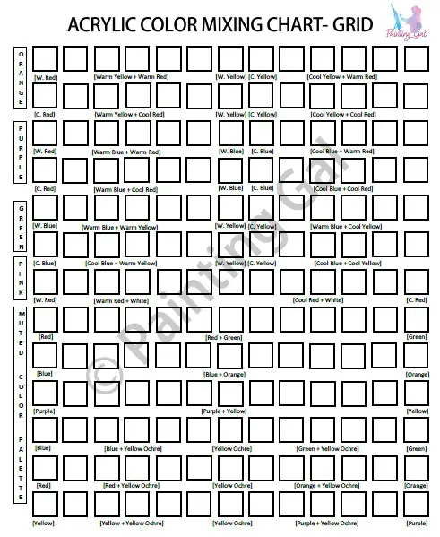
Therefore I have made the color mixing grid with secondary colors, and muted colors in mind. These are the mixed colors you will need when doing a painting. The first 3 rows of my color mixing chart are dedicated to oranges (mixing yellows and reds). Here I have mixed all 3 types of red colors with two types of yellows I have.
If you are interested in learning in detail about mixing orange colors, you can read the following article: How to make orange with paint? Mixing shades, tints, hues
Next, I made green (mixing yellows and blues) and purple (mixing blues and reds) rows. I have written a whole article about what colors make violet. You can get into a deeper dive into mixing violet colors there.
Next, I have a row dedicated to pink (mixing reds with titanium white) as it is a distinct color we use. All of these colors are very saturated in most cases.
I have also written a whole article about making magenta color. You will find a detailed explanation about magenta and where it fits in our color palettes.
Light blue is also a tint like pink, that we often use. If you want to learn how to mix sky blue you can read the following article: What acrylic colors make sky blue? (matching a sky photo).
The rest of the rows were for my muted color palette. In nature, you will mostly find muted colors and earthy colors. These will be mostly used in your paintings. You can get muted colors by mixing complementary colors. So I used a few rows to mix complementary colors.
Next, I mixed each color with yellow ochre. Yellow ochre is a muted earthy yellow color. You can make any color muted by mixing it with yellow ochre easily. Below I have put down a grid you can use to make your color mixing chart.
Mixing colors for the color mixing chart
As said before I like to have several hues (another word for color) of secondary colors. So each orange, green and purple color in the color chart has 5 different hues. This means there are 5 colors in between two primary colors.
As an example, I have 5 different oranges in between pyrrole red and cadmium lemon. This way you can see 5 possibilities for oranges when mixing red and yellow. You can easily see the change of value (lightness or darkness of a color) when mixing different ratios of two colors.
If you mix the dark color more you will get a color with less value. If you mix more of the light color you will get a color with a higher value. If you do not understand the color terminologies I am using, you can refer to the color terminologies above.
Most importantly you can get a muted color palette by making a color mixing chart. Muted colors are created by mixing complementary colors. Following are the complementary color combinations.
- Green and red
- Orange and blue
- Purple and yellow
If you mix a color with its complementary you can mute that color. If you check the complementary color rows in my muted color palette, you can see this. Check the colors between green and red in the acrylic color mixing chart. You can see a wide range of muted greens and yellows obtained by mixing green and yellow.
You can get browns and greys by mixing complementary colors. This is a good color mixing exercise to do, on a large color mixing chart like this or separately on a new paper.
I have written a whole article about ‘what colors make silver?’. There you will find an in-depth guide on each element going into silver color paint.
If you are interested to know an easy method of mixing brown/ tan colors and mixing skin tone, you can read my article ‘What colors make tan? Color mixing guide and skin tones‘. You will also get a free skin color mixing chart-grid as well.
Another thing with complementary colors is that you can get the highest contrast in a painting by keeping the complementary colors close to each other.
The color mixing chart I made does not have tints and shades of colors As mentioned before. If that is something you often need for paintings you can dedicate rows for shades and tints. But I have tints of red to represent pink as it is a distinct color we know. Likewise, you can add rows for the tints of other colors as well.
If you want to know how to start painting, whether to start from the background or the foreground, you can read my article; Do you need to do the background first in a painting?
Conclusion
Color mixing is a fun and very calming activity. It can increase our awareness of different colors. By making a color mixing chart, you will know what colors to mix to get a certain color. As we understand more about colors, it makes it easy to build depth in our paintings and to move a step ahead in our painting journey.
FAQ
How do you mix acrylic paints with different colors?
Acrylic paint can be mixed with different acrylic paint colors. Use good quality acrylic paint to get saturated colors. Primary acrylic colors which are yellow, blue, and red are mixed to create secondary colors which are orange, purple, and green.
What colors do you mix to make different colors?
To make different colors mix primary colors in different ratios. Cool and warm color combinations make muted colors while mixing only cool colors or warm colors makes vivid, vibrant colors. Mixing complementary colors results in muted colors.

